Practice Excel Assignment
Walkthrough
The following instructions are
intended to guide INSS 300 students through the Practice Excel Assignment. These
instructions are focused solely on this assignment, and not designed to be a
comprehensive introduction to all of Excel’s features. They assume the use of an Excel
version that comes with Microsoft Office 365 ProPlus, available to all University of Baltimore students under the Office 365
license. With other versions of Excel, menus and options may work differently
from what has been described here.
Remember to periodically save
your changes.
Initial
Steps
o
From
the posted assignment, right-click the data file ORDERS_Truncated.xlsx, click
‘Save Link As…’ and save it to your computer with the
name <yourfirstname_<yourlastname>_Practice_Excel_Assignment.xlsx.
For example, Rajesh_Mirani_Practice_Excel_Assignment.xlsx. Make a note of the
drive and directory pertaining to the saved location.
o
In
Windows, display the drive and directory corresponding to your saved location,
and double-click the name of your saved data file so that it opens in Excel, as
follows.
o
Your
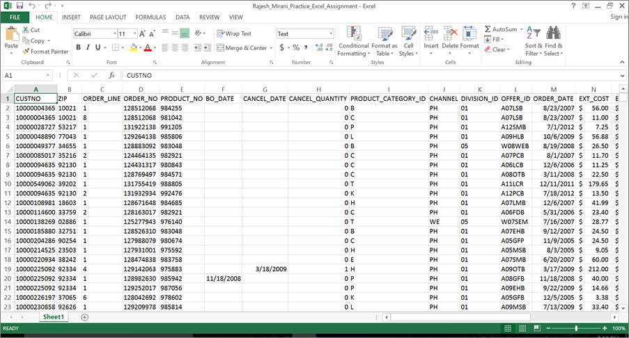
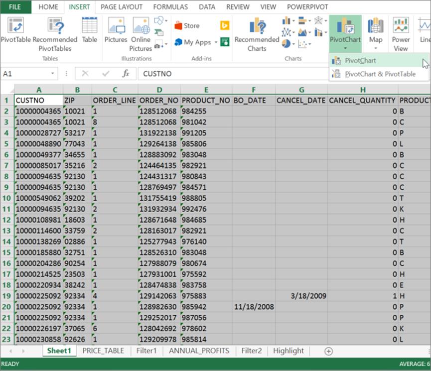
Excel spreadsheet currently comprises of a single worksheet labeled ‘Sheet1.’ Scroll
up and down as well as left and right in Sheet1 to obtain a sense of its
contents. As described in the assignment, this worksheet comprises of 4069
rows, including a header row, and 22 columns A through V. Note how the contents
of each column relate to the column’s definition in the assignment. You may
fast-scroll to various row and column extremities by using keyboard
combinations such as CTRL+HOME, CTRL+END, CTRL+LEFT ARROW, CTRL+RIGHT ARROW,
CTRL+UP ARROW, AND CTRL+DOWN ARROW.
Data
Preparation
Add the following new columns to the right end of the Excel
spreadsheet, and populate them with computed data by applying appropriate
formulas, based on the following information.
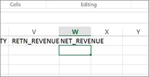
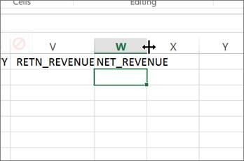
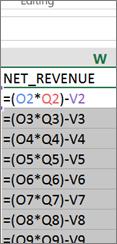
i. NET_REVENUE
in Column W, defined as: (Extended Price in column O times Shipped Quantity in column
S) minus Return Revenue in column V.
To accomplish step (i), scroll over to the cell W1,
type NET_REVENUE into that cell, and hit ENTER.
Note that the width of column W is less than the width of the text you just
typed into cell W1. You may automatically widen column W just enough to
accommodate your typed text by hovering your cursor at the boundary between the
headers of column W and column X such that the cursor’s shape changes to a
double-headed arrow. Keeping the cursor in place with its new shape,
double-click the mouse. Note how the width of column W increases just enough to
accommodate all currently typed text in that column.
|
|
|
|
Now highlight column W
with a single click on the W header. Then click the HOME tab in the menu across
the top, and finally click the $ symbol located in the top center of the screen
to format all values to be entered in this column as dollars.
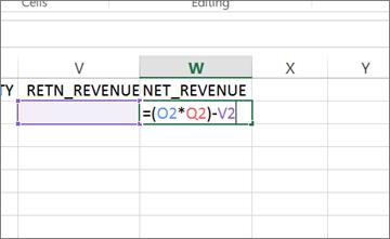
Next, place your cursor
in cell W2, type the formula “=(O2*Q2)-V2” without the
quotes, and hit ENTER.
|
|
|
|
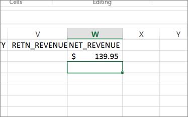
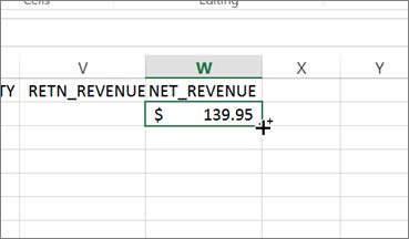
Finally, copy the
formula you just entered in cell W2 to cells W3 through W4069. To do so, click
cell W2 once, then position the cursor on the dot in the lower right-hand
corner of that cell such that the cursor’s shape changes to a ‘plus’ symbol.
Keeping the cursor in place with its new shape, double-click the mouse to automatically
copy the formula contained in cell W2 into cells W3 through W4069.
|
|
|
|
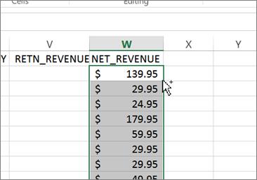
You may click the function key F2 in each cell to note how the copied formulas
now reference their respective rows. To exit a formula and return to the
computed cell value, press the Esc key.
ii. NET_PROFIT in
Column X, defined as: (Shipped Quantity in column S minus Returned Quantity in
column U) times (Extended Price in column O minus Extended Cost in column N).
Apply your learning from step (i) to accomplish this step.
iii. SALE_YEAR in
Column Y, defined as: The four digit year contained in the Order date in column
M.
The formula you will need to enter in cell Y2 is “=YEAR(M2)”
without the quotes.
Apply your learning from step (i) to accomplish other
parts of this step.
iv. PERCENT_RETURNS
in Column Z, defined as: Returned Quantity in column U divided by Shipped
Quantity in column S, but only if Shipped Quantity is greater than zero. (If
Shipped Quantity is zero, the value in Column Z is to be entered as zero also.)
Excel’s built-in
logical function IF is the best approach for putting together a formula here. The
formula you will need to enter in cell Z2 is “=IF(S2<>0,U2/S2,0)”
without the quotes. Its interpretation is as follows: If the value in cell S2
is not equal to zero, then compute Z2 as U2 divided by S2, else compute Z2 as
zero.
Apply your learning
from step (i) to accomplish other parts of this step.
v. NET_QUANTITY
in Column AA, defined as: Shipped Quantity in column S minus Returned Quantity
in column U.
Apply your learning
from step (i) to accomplish this step.
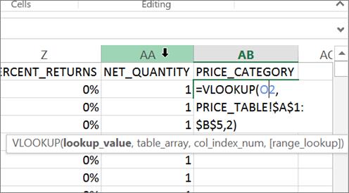
vi. PRICE_CATEGORY
in Column AB, defined as: ‘1’ if Extended Price in column O is less than $100,
‘2’ if Extended Price is at least $100 but less than $200, ‘3’ if Extended
Price is at least $200 but less than $300, and ‘4’ if Extended Price is greater
than $300.
Excel’s built-in
function VLOOKUP is the best approach for putting together a formula here.
VLOOKUP, or vertical lookup, searches an ascending list in the first column of
a user-provided table, looking for a particular value. It starts its search in
the top row of the first column, moving the search vertically down one row at a
time. Upon finding the very first exact match or a higher value, it anchors
itself to that row, and now looks horizontally across that matching row in
order to retrieve the value of the cell contents of the second or third column,
as requested.
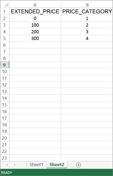
To accomplish step (vi), therefore, we will create and define the following
table in a new worksheet in order to apply VLOOKUP to it:
|
EXTENDED_PRICE |
PRICE_CATEGORY |
|
0 |
1 |
|
100 |
2 |
|
200 |
3 |
|
300 |
4 |
To do so, first click
the ‘New Sheet’ button (i.e., the + symbol) next to the Sheet1 tab at the
bottom of the screen.
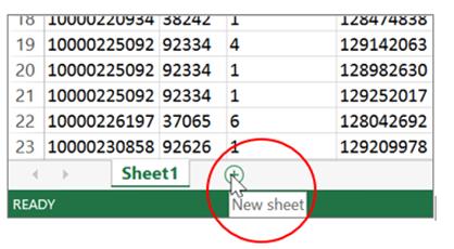
In the resulting new
Sheet2 worksheet, type this user-defined table starting at location A1, as
follows:
Next, double-click the
Sheet2 tab and change its label by typing the word PRICE_TABLE in its place. Hit
ENTER when done.
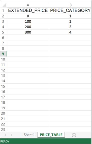
Now click the Sheet1
tab to return to your original data. The formula you will now need to enter in
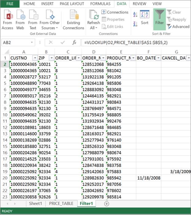
cell AB2 is “=VLOOKUP(O2,PRICE_TABLE!$A$1:$B$5,2)”
without the quotes.
In
the above formula, O2 represents the price looked up.
PRICE_TABLE!$A$1:$B$5 represents the location of the user-defined
lookup table. The $ symbols denote an absolute, fixed location for the lookup
table.
The number 2 before the close of the parenthesis
represents the column number whose cell contents are to be retrieved.
Apply your learning
from step (i) to accomplish other parts of this step.
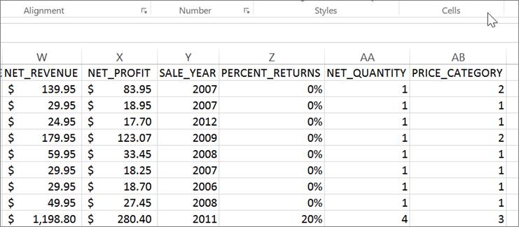
In summary, the six
newly defined columns should appear as follows:
Analysis
1.
Copy the original sheet
(‘Sheet1’) containing data in all of your columns A through AB into a new sheet
called ‘Filter1. Then apply a filter to the copied data in this new sheet in
order to answer the following question: Which year had the highest canceled
quantity in a single order? Provide the pertinent details.
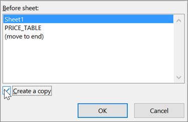
To start off this step, right-click the Sheet1 tab at the bottom, select ‘Move
or Copy…’ and then finally place a check in the box labeled ‘Create a copy’
before clicking the OK button.
|
|
|
|
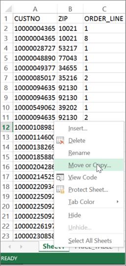
This results in the creation of a new worksheet called ‘Sheet1 (2),’ containing
a copy of the original data. Double-click the new tab and change its label from
‘Sheet1 (2)’ to ‘Filter1.’
We are now ready to
answer Question 1.
In the Filter1 sheet,
click the DATA
tab in the menu across the top, then click the Filter symbol located near the
top center of the screen. This should result in drop down arrows appearing on
the right edges of each column header, as follows:
Click the drop down arrow next to the CANCEL_QUANTITY header in column H. From
the resulting drop down box, unselect (i.e., uncheck) all items in the
displayed list of all column H values, and then reselect only the highest
value, i.e., 5. Finally click OK.
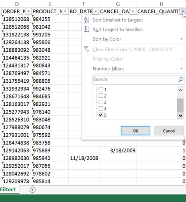
Note the lone order that appears on the screen containing this value of 5 under
CANCEL_QUANTITY.
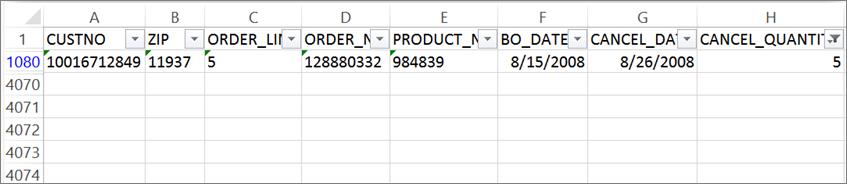
Using the information from the above analysis, answer Question 1, providing not
only the year asked for (i.e., 2008), but also other pertinent details that
support your answer, e.g., customer number, order number, and order date.
2.
Now consider
ALL orders in the year you found in Question 1 above. Compare them collectively
with orders in other years. Provide two meaningful observations about this
particular year from your comparative analysis.
It is possible to answer this question in any number of ways, but we will
demonstrate below how to compare the year 2008 with other years, by comparing
total annual net profits in each year.
First, copy the original data in Sheet1 to another new sheet that we will call
ANNUAL_PROFITS, using the method described under Question 1.
In this new ANNUAL_PROFITS sheet, click any cell containing data, then press
CTRL+A on the keyboard to highlight all data in the sheet. Next, click the
DATA tab in the menu across the top, and then click the Sort symbol located to
the left of the Filter symbol near the top center. This brings up the following
screen:
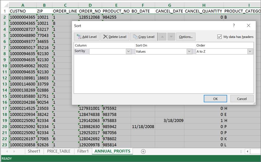
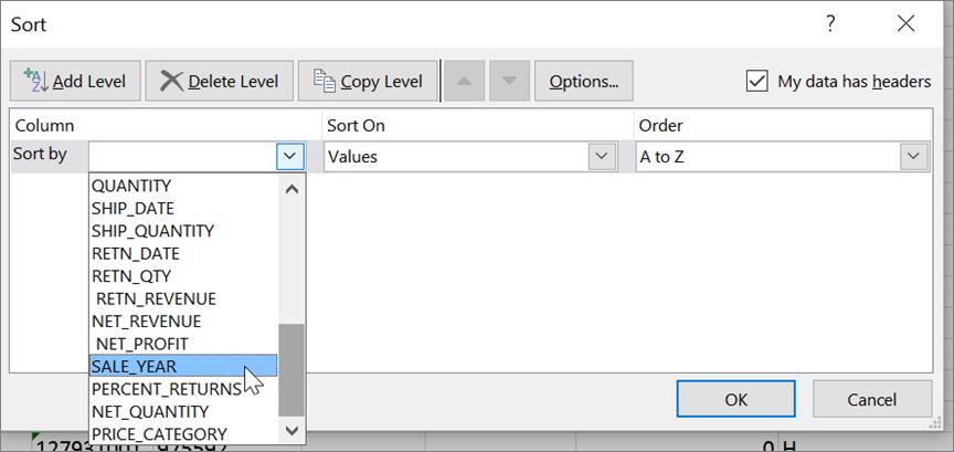
Now click the arrow in the ‘Sort by’ box, select SALE_YEAR, and click OK:
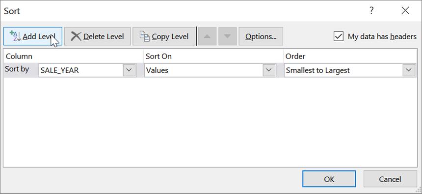
The above operation results in a sorting of the rows in the ANNUAL_PROFITS
sheet, by the SALE_YEAR field. Once again, press CTRL+A on the keyboard to
highlight all data, and click Sort to bring up the Sort dialog box. After
visually confirming that the SALE_YEAR sort entry from the previous step is
showing, click the Add Level button:
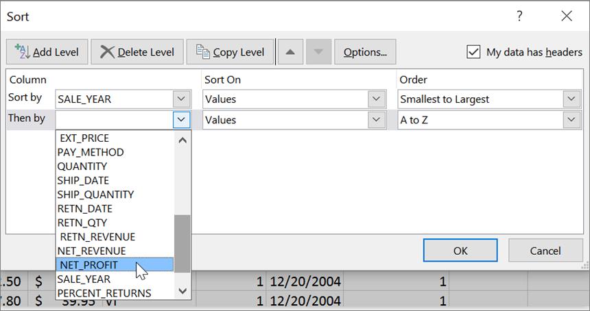
Select NET_PROFIT as the second level sorting field and click OK:
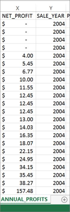
Observe how the results of these two steps have resulted in a two-layered sorting
of the rows in the ANNUAL_PROFITS sheet. All rows have first been sorted in
ascending order by SALE_YEAR, and, within each year, by NET_PROFIT:
We will now insert yearly subtotal rows by NET_PROFIT into this sheet. To do
so, click the
DATA tab in the menu across the top, then click the Subtotal menu option near
the top right of the screen:
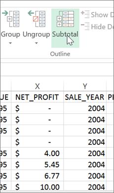
This brings up the Subtotal dialog box. In this box, select SALE_YEAR under ‘At
each change in.’ Next, check the NET_PROFIT field under ‘Add subtotal to,’ and uncheck
any other checked fields there. Finally make sure that there is a check in the ‘Summary
below data’ check box, and click OK.
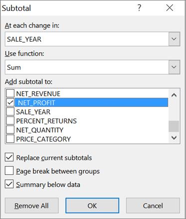
The above operation results in the insertion of new rows containing yearly
subtotals for NET_PROFIT, after all the order records for each year. Scroll
down the SALE_YEAR and NET_PROFIT columns to view these inserted rows. The
following is a snapshot of the summary row for the year 2004.
You may conduct other analyses similar to the one above, by substituting
NET_PROFIT with other measures of business performance such as NET_REVENUE.
Using aggregate comparisons of the year 2008 with other years from all these
analyses, answer Question 2, providing pertinent details as necessary to support
your answer.
3. Copy the original sheet (‘Sheet1’) containing data in all of your
columns A through AB into a new sheet called ‘Filter2.’ Then apply a filter to
the copied data in this new sheet in order to answer the following question:
Which payment methods were used for orders with the highest net profit (top
1%)? Provide the pertinent details.
In order to answer this question, first copy the original data in Sheet1 to
another new sheet labeled Filter2, using the method described under Question 1.
Following this, in the Filter2 sheet, click the Filter symbol to reveal the drop down arrows on
the right edges of each column header, also using the
method in Question 1.
Next, click the drop down arrow next to the NET_PROFIT header in column X. In
the resulting drop down box, click ‘Number Filters,’ and then ‘Top 10…,’:
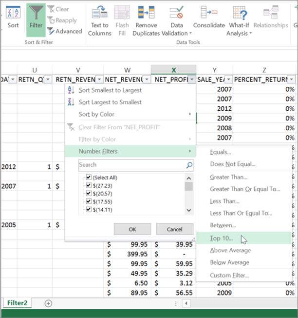
In the resulting ‘Top 10 AutoFilter’ dialog box, select ‘Top,’ ‘1,’ and
‘Percent’ respectively, and click OK:
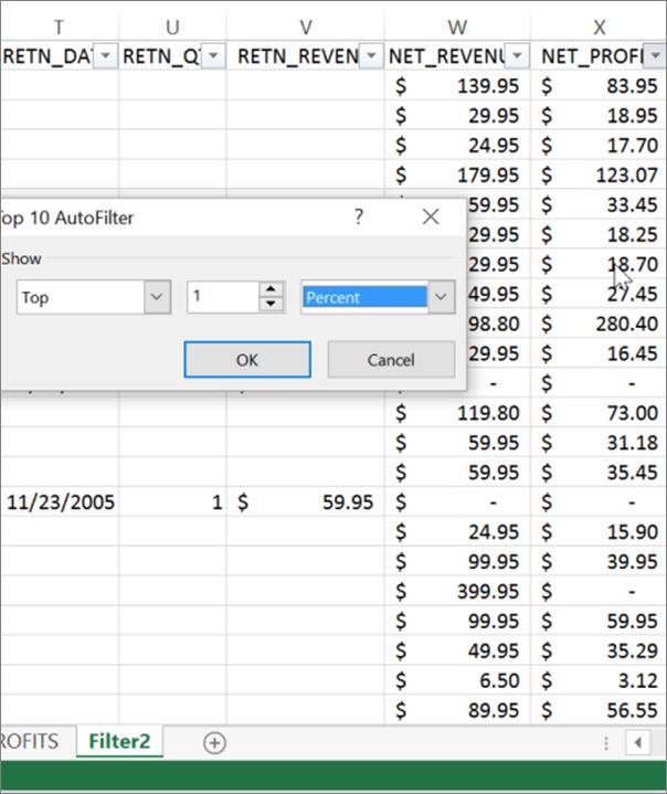
The above operation filters the view to only those rows containing the top 1%
of values of NET_PROFIT, resulting in a display of only 40 of the 4068 records.
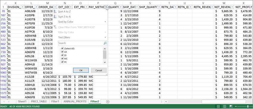
You may now answer Question 3 by clicking the drop down arrow next to the
PAY_METHOD header in column P and noting the values listed there. Provide any
other pertinent details as necessary to support your answer.
4.
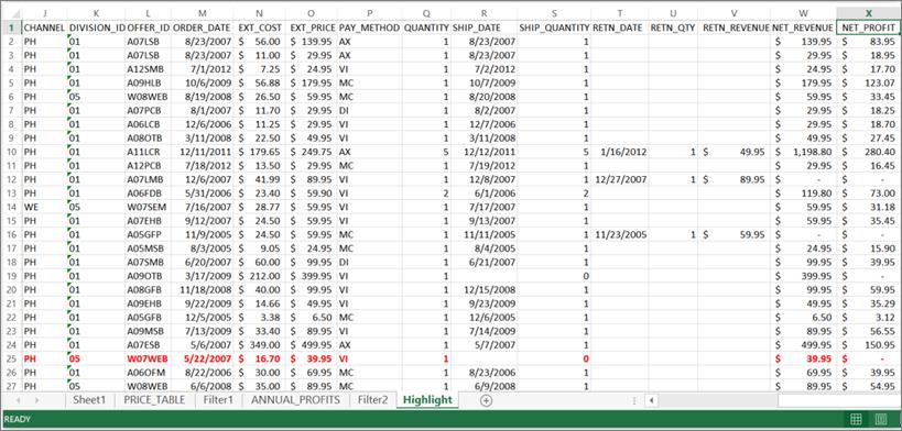
Copy the original sheet
(‘Sheet1’) containing data in all of your columns A through AB into a new sheet
called ‘Highlight.’ Then apply conditional formatting to the copied data in
this new sheet in order to highlight orders made by division 05 where net profit
was in the bottom 25% of all orders.
In order to answer this question, first copy the original data in Sheet1 to
another new sheet labeled Highlight, using the method described under Question
1.
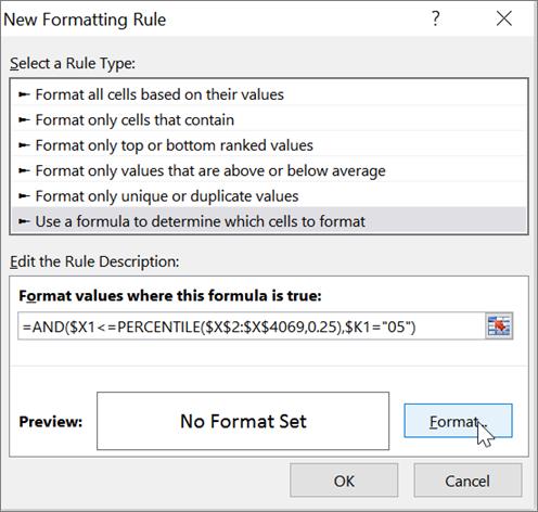
Next, click the cell X1 containing the column title NET_PROFIT, then press
CTRL+A on the keyboard to highlight all data in the sheet. Next, click the HOME tab in the
menu across the top, and then click the Conditional Formatting symbol, followed
by ‘Top/Bottom Rules,’ and ‘More Rules…’

This opens the ‘New Formatting Rule’ dialog box. In the top
half of this dialog box, select ‘Use a formula to determine which cells to
format.’ In the bottom half, enter the formula =AND($X1<=PERCENTILE($X$2:$X$4069,0.25),$K1="05")
into the text box labeled ‘Format values where this formula is true:’ and then
click the Format button.
In the above formula, $X1 represents a
relative reference to successive cells in column X, starting with the first
cell X2 in the range X2 through X4069. The ‘1’ in $X1 denotes the first cell of
that range.
0.25
represents the bottom 25th percentile.
Similarly,
$K1 represents a relative reference to successive cells in column K starting
with row 2.
The
logical operator AND combines the two conditions that govern the formatting
rule.
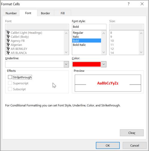
In the resulting ‘Format Cells’ dialog box, select the color and font that you
would like for the highlighted cells. Then click OK in the two open dialog
boxes to complete the conditional formatting process.
The
worksheet ‘Highlight’ should now highlight orders at division 05 where net
profit was in the bottom 25% of all orders:
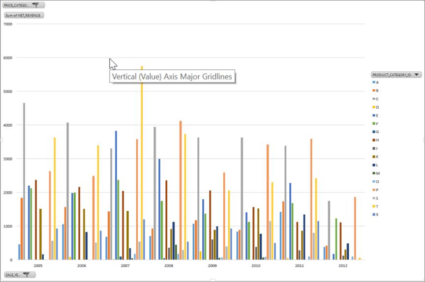
Create pivot charts to answer questions 5 through 8.
5. In how many distinct years
during the period 2005-2011 did product category E generate the highest total
net revenue, compared to other product categories? Which years were they, and
what were the total net revenues for product category E in those years?
To create this
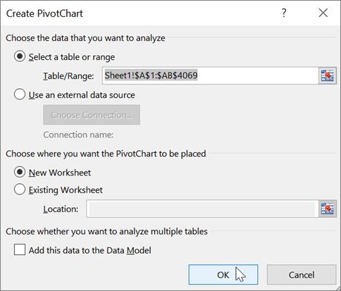
PivotChart, first return to Sheet1 containing the original data. Click any cell
containing data, then click CTRL+A on the keyboard to highlight all data in
Sheet1. Next, click the INSERT tab in the menu across the tab, then click
PivotChart, and PivotChart once again.
In the resulting Create PivotChart dialog box, make sure that the Table/Range
text box displays Sheet1!$A$1:$AB$4069 and that ‘New
Worksheet’ has been selected underneath. Then click OK.
Note that Excel has created a new sheet called Sheet2 and placed an empty
PivotChart in it. Next, you will specify the contents of this PivotChart, by
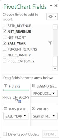
dragging and dropping field names contained in the list under ‘PivotChart
Fields’ on the right of the screen, into the four white spaces underneath
respectively titled FILTERS, LEGEND, AXIS, and VALUES.
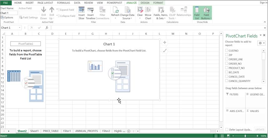
Before proceeding further, double-click the Sheet2 tab and rename it ‘Question
5.’
To answer Question 5, first drag NET_REVENUE from the list into the VALUES
space, as follows.
|
|
|
|
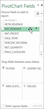
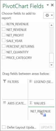
Upon dropping NET_REVENUE into the VALUES space, it will show as ‘Sum of
NET_REVENUE.’ Next, drag and drop SALE_YEAR into the AXIS space, and
PRODUCT_CATEGORY_ID into the LEGEND space:
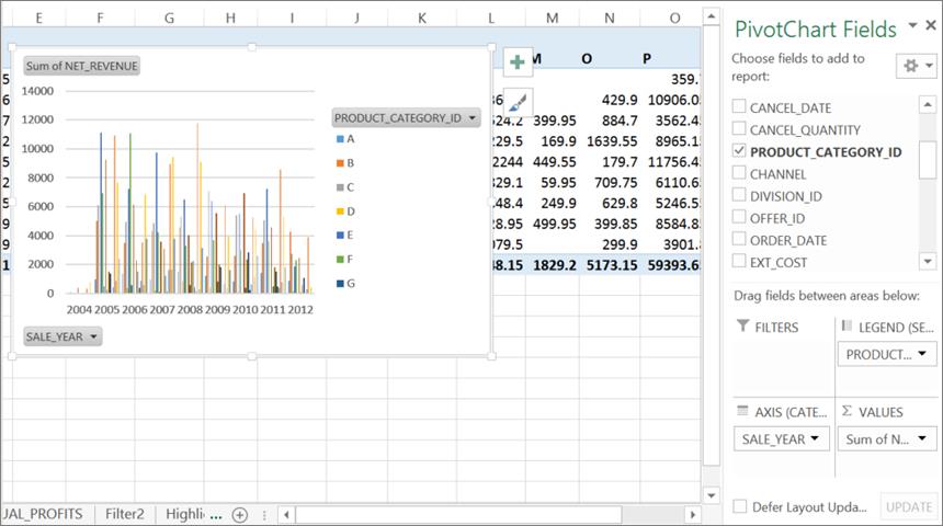
Our next step will be to restrict the years displayed on the X axis to 2005
through 2011. To do so, click the SALE_YEAR button located at the bottom left of
the column chart, and in the resulting dialog box remove the checks
corresponding to 2004 and 2012.
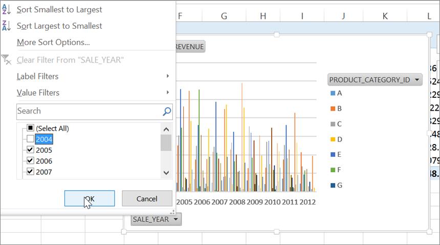
Clicking the OK button changes the chart to the following:
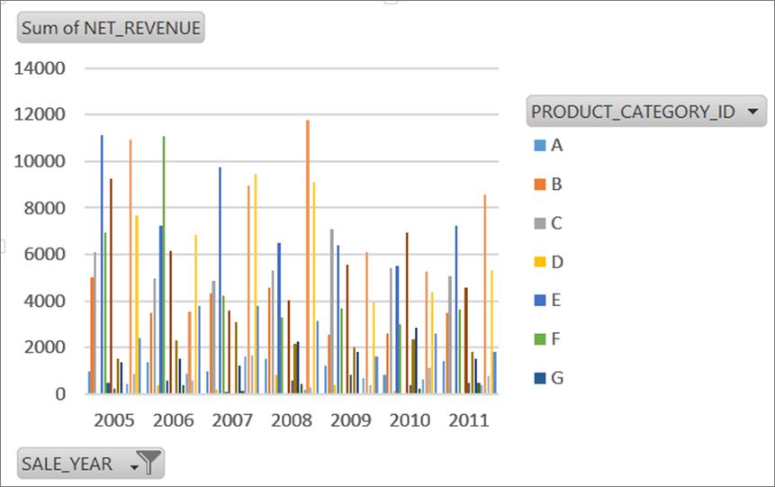
Now drag any of the four handles at the corners of this chart to enlarge it, so
that it displays all product categories A through X:
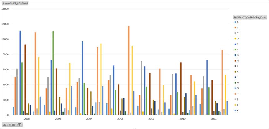
You may now answer Question 5 by comparing the heights of the columns in this
chart. Provide all pertinent details as necessary to support your answer.
6.
How does the answer to
Question 5 above change if each of the four price categories in column AB are
analyzed separately?
To answer Question 6, repeat the PivotChart creation process described in
Question 5, saving your new PivotChart to a new sheet called ‘Question 6.’
After dragging and dropping NET_REVENUE, SALE_YEAR, and PRODUCT_CATEGORY_ID into
the respective spaces, also drag and drop PRICE_CATEGORY into FILTERS:
Next, click the PRICE_CATEGORY button located at the top left of the column
chart, and in the resulting dialog box select ‘1’ and click OK to display
results pertaining only to price category 1 (i.e., products under $100):
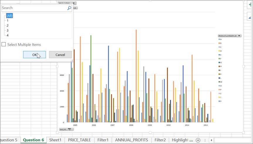
Note how the heights of the various columns in the chart have changed as a
result of filtering the view to sales of products under $100 only. Make your observations
from this chart in order to answer Question 6:
Repeat the filtering process described above three more times, selecting price
categories 2, 3, and 4 respectively in these other iterations. When done,
answer Question 6 based on all of your observations from the four filtering
iterations. Provide all pertinent details as necessary to support your answer.
7. Which specific combination of division ID and sales channel had the
highest average percent returns, compared to all other combinations of division
IDs and sales channels (e.g., Web sales in division 01, or, mail order sales in
division 05)? What was the percent value of this highest average return rate?
To answer Question 7,
repeat the PivotChart creation process described in Question 5, saving your new
PivotChart to a new sheet called ‘Question 7.’ Drag and drop both DIVISION_ID
and CHANNEL into the AXIS space, and PERCENT_RETURNS into the VALUES space:
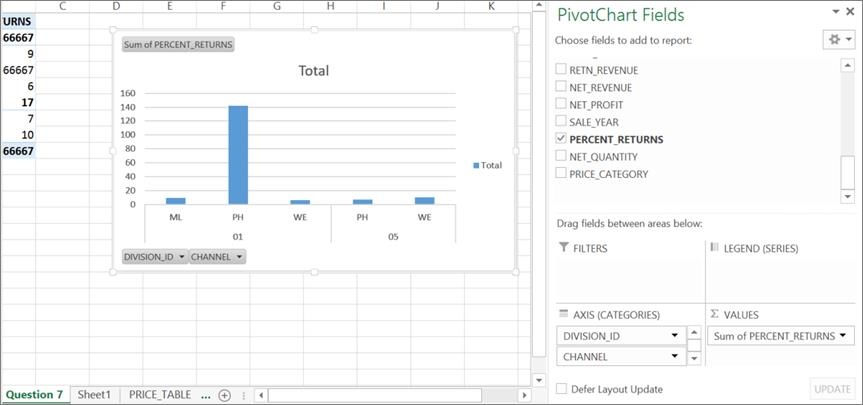
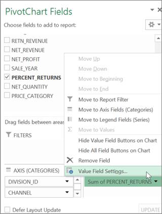
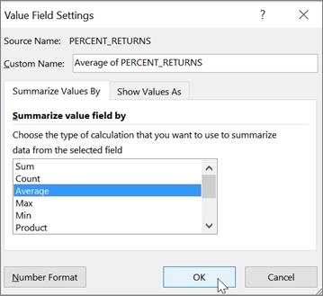
Since Question 7 asks about average PERCENT_RETURNS rather than total or sum of
PERCENT_RETURNS, our next step is to change the display from ‘Sum of
PERCENT_RETURNS’ to ‘Average of PERCENT_RETURNS.’ To do so, click ‘Sum of
PERCENT-RETURNS’ in the VALUES space, then click ‘Value Field Settings…’ in the
drop down box that appears. In the resulting ‘Value Field Settings’ dialog box,
change the selection from Sum to Average and click OK:
|
|
|
|
Your chart should now change to the following display of ‘Average of
PERCENT_RETURNS’:
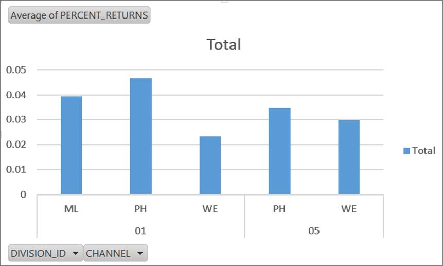
You may now answer Question 7 by comparing the heights of
the columns in this chart. Provide all pertinent details as necessary to
support your answer.
8. Create a bar or column chart of sum of net quantity on the vertical
axis against price category on the horizontal axis. Do you observe a distinct
pattern? Suggest a possible business or consumer rationale for this pattern.
To answer Question 8, repeat the PivotChart
creation process described in Question 5, saving your new PivotChart to a new
sheet called ‘Question 8.’ Drag and drop PRICE_CATEGORY into the AXIS space,
and NET QUANTITY into the VALUES space. The resulting chart will appear as
follows:
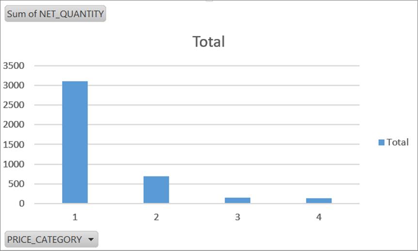
You may now answer Question 8 by observing a trend pertaining to changes in the
heights of the columns in this chart. Provide all pertinent details as
necessary to support your answer. Offer a possible rationale oriented to
consumer spending habits in order to answer this question properly.
After completing this practice assignment, you
may now attempt the actual Excel assignment.