Using Tables for Page Formatting
One of the major problems with HTML is that it makes difficult to create margins, align text and the like. HTML 4.0 provides an elegant solution through the use of style sheets. But it requires more sophisticated Web design techniques. The solution to keep it simple is to use tables to do page formatting. This tutorial was created with a table with no borders and two columns only.
0. Before you begin
- The first thing you should know when thinking in page design is that your page will be seen in different browsers, monitors and screen resolutions. The "standard" (if there is one) for monitors and resolution is a 17inches monitor running at 800 by 600 resolution, 256 colors. This is what is expected that the average user has, but in reality you should prepare your pages to be seen from 15 to 19 inch monitors, running 640 by 480 to 1,024 by 1024 resolution, 32-bit colors.
- A beginners mistake is to define the tables in pixels or inches, rather than in percentages. If you define in pixels your page will be seen well in some monitor-resolution combination, but not in others. Therefore always use percentages to define your columns in a table. Your table will always fill the screen and your columns will keep their relative sizes. In this tutorial I defined the left column taking 15% of the screen and set a different background color to it.
- Another important consideration is how browsers treat blank cells in a table. If you leave a cell blank (you do not type anything) Internet Explorer fills it with a blank. Netscape and Firefox, however doe not include a blank and the table looks unfinished as in this example. Therefore, do not leave a cell blank include a non-blank space there using the code Just pressing the space bar will not do it for HTML ignores white-space.
- When using tables for page formatting the table should have no borders or borders equal to zero. You should also set 5-10 pixels cell spacing (space between cells) or 3-5 pixels cell padding (space within cells). I tend to set 5 pixels cell padding, but you should try to see what looks best in your case and then decide.
- Finally, you should use a tool to create tables that you feel comfortable with. In this tutorial I will show how to use KompoZer and Microsoft Word to develop tables for page formating. A choice of editor is a question of preference, not a technical decision.
1. Using KompoZer (Nvu)
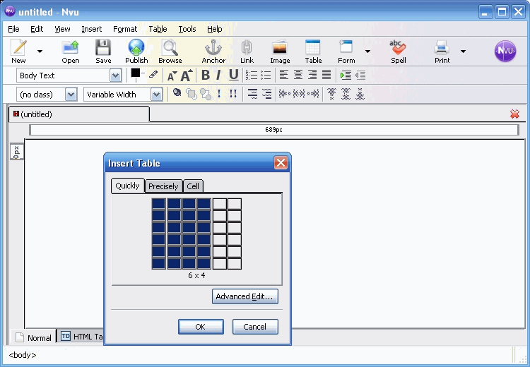
To create a table for page formatting is similar to using tables regularly. You start by clicking in the New icon in Nvu. Of course if you are starting Nvu you are already placed in a blank page with a HTML editing toolbar on the top. When you click on the tables symbol the insert dialog opens and let you select the size of your table, as shown below.

Let us work with an example and see how we would define a table for page formating (we will use the same example later on). Suppose we want to create a document with two columns of text and leave a margin at the left side of the document, on which me may wish later on to place a background image, or color. The left margin does not need to be as large as the other columns, lets say 17%, while the others would be 42 and 41% respectively.
- start by clicking on the table symbol in the toolbar and you will see a dialog as shown above.
- make the number of rows equal to one (the whole page) and the number of columns equal to three in the example and you will see a small blank table.
- double-click the table and you will see the table properties dialog. Select the Table tab and set the border width to one, cell padding to five, select left as the table alignment, and select (click) table width, equal to 100 %, finally click on Apply and Ok and the table will resize to the new specifications.
- double-click in the first cell and you will see a dialog to modify cell attributes. Set the cell width to 17% (the margin in our example) and click Apply.
- click on Next on select cell and you will see the empty table with three columns now formatted for the 17% margin and a dark mark in the second cell and the cell dialog superimposed alowing you to select 42% for the second cell width. Click Apply and OK and the formatting is done.
- You can now enter text in the second and third columns as was the original intention. You have two separated and paralell columns of text as in a newspaper. Of course you could have created more columns, and even nexted tables to create a very interesting page design.
- When you are done entering text, double- click in any cell, select the Table tab, and make the border width to zero pixels to remove the borders. Save your page and you are done.
- Note: Nvu will show the empty borders as double dotted red lines around the cells, for your information only, that will not display on the Web.
2. Using Microsoft Word
To create a table for page formatting is similar to using tables regularly. We will use the example discussed previously. When you open Word you will see the basic toolbar as shown below:

- start by clicking on the table symbol in the editing toolbar and selecting three cells in the first row while holding the left button of the mouse and a blank table will be inserted in your document..
- right-click on the blank table and select table properties. Check preferred width to 100 measured in percent, and select left as the table alignment.
- In the same table properties dialog, click on Options and select a space between cells, then click on Borders and shading and select None and click Ok.
- right-click in the first cell and select table properties again. Select the column tab and check preferred width to 17 measured in percent. Finally, click on next column and set the preferred width to 42 measured in percent. Repeat the same operation to the last column and set the width to 41%. You are done with formating.
- Enter the text as discussed in the Nvu example and then save as html. You can see the simple table here.
3. Advanced topic
You may wish to include a background image that will fit in the first column (margin) of the example, to make the page look better. To do so:- change the body tag to <BODY BACKGROUND="yellow.jpg"> , where yellow.jpg would be the background image.
- start your table with the following code in a
two-column table:
<TABLE><TR><TD VALIGN=top ALIGN=left><IMG SRC="vspacer.gif" HEIGHT=1 WIDTH=125 ALT=" "><br> </TD><TD VALIGN=top ALIGN=left WIDTH="100%">
- download the special vspacer.gif file by righ-clicking here and selecting Save link As.
- copy the vspacer.gif to the same directory of your page with the table.
- be sure that you do not include images in your second column that will make the second column over-reach. In this case the browsers will get confused and part of the right side of your text will not be seen. Images over 480 pixels in width may do it.
- There are collections on the net of images and background borders (see my tutorial on images for more details). This is one of many such collections. Be sure to download background borders with a width of 1,024 pixels.
- For border backgrounds of different sizes and more columns you will have to experiment in your own.
This page is maintained by Al Bento who can be reached at abento@ubalt.edu This page was last updated on May 17, 2007. Although we will attempt to keep this information accurate, we can not guarantee the accuracy of the information provided.