
More on styles, hotspots, frames
More on styles
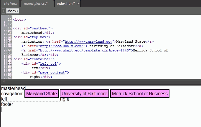
We had an introduction to styles in expression web to create page layouts, but we need to step back and look at its use to format page elements, how to create classes, division ids, manipulate fonts, and understand pseudoclasses. Once this is done we will get back to its use to page layout. We will use an example that starts with a new site, and then File, New Page, CSS layout, header,navigation, two columns, footer. The result (with text added so that we can better see each area) is shown in this image. Please note that the external css file was saved as morestyles.css and the html page was saved as index.html.
Styles and fonts
Fonts can be defined using px (pixels), pt (point), in (inches), cm (centimeters), mm(millimeters), em (emspace, the hight of the letter m), ex (xheight), and %. The basic rules are: - use px for items that need as fixed size (images, certaintables,fancy headings, menus, etc).
- use em for content that may be resized for improve viewing.
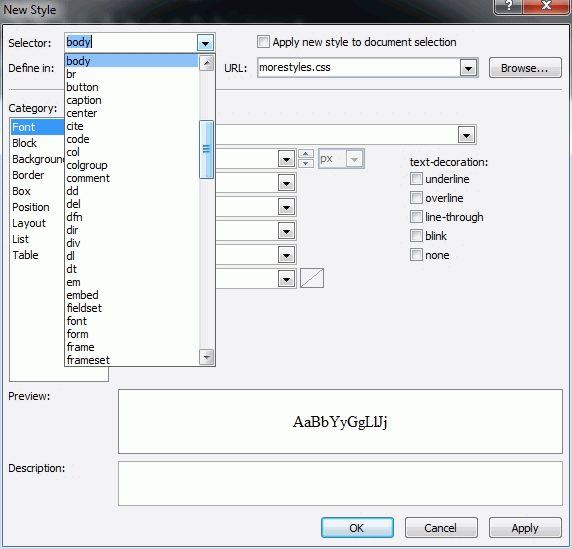
We can set the font for the whole document by clicking on New styles in the right, bottom pane, selecting the body tag from the selector drop down menu and choosing the font attributes we want. Please note that we set the style to be saved in external style file, morestyles.css. We can always modify the styles by selecting one of them, e.g.body, right-clicking and selecting modify styles.
We can also use font properties to remove the blue underline from a link. In our example we added three links to the navigation, as shown here. Lets now remove the blue underline and do something better.
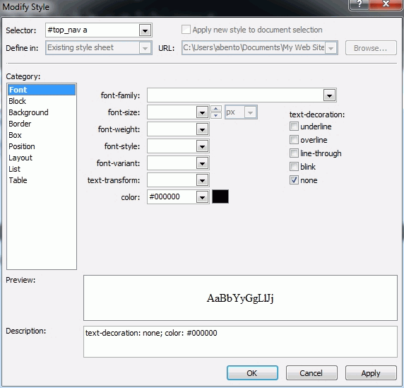
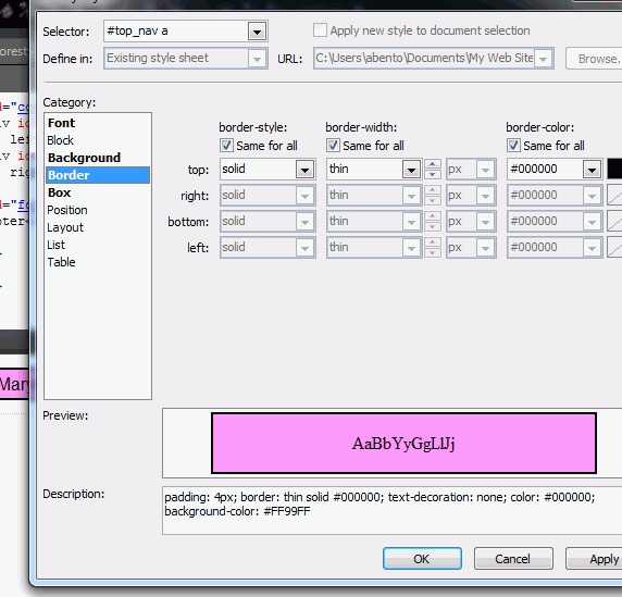
- right-click in the navigation area of the index.html page, click on New Style, in the right, bottom pane, name the style #top_nav a (select #top_nav from the selector and add a), select Font, text-decoration: none and text color to black; be sure to select to save in the external style sheet, as shown in this image.
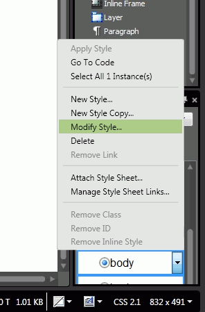
- this removed the underline and changed the text color to black, but we need to let the users know we have some sort of button links. therefore lets select the #top_nav a in the CSS styles in the right, bottom side, right-click, choose Modify Style and add a background color, border style:solid,width: thin, color: black; box padding 4 to all, as shown in this example.
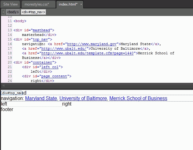
- the final product is a button-like effect of the links in the navigation bar, as shown in this image. Do not forget to Save All (both the page and external CSS were changed.
Style classes
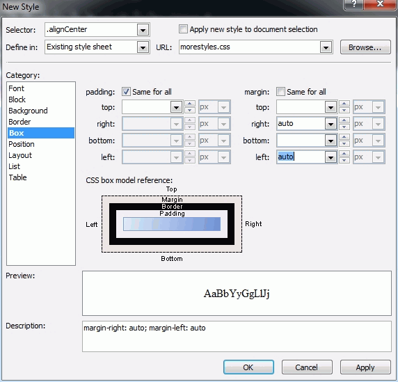
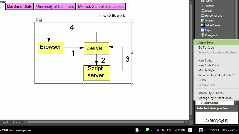
. When we select page elements such as body, a, h2, p and create styles they apply to the whole page. We saw an example where we defined the element a style to apply to the navigation bar, only. Style classes apply effects in parts of a page It is defined by using a . ( dot) in front of a style name, as for example: .alignCenter. Lets work on an example: copy and paste an image (cgis.gif) in the site we have been using, then drag and drop this image in the right column, as shown here Please note that the name of the right column division is #page_content.
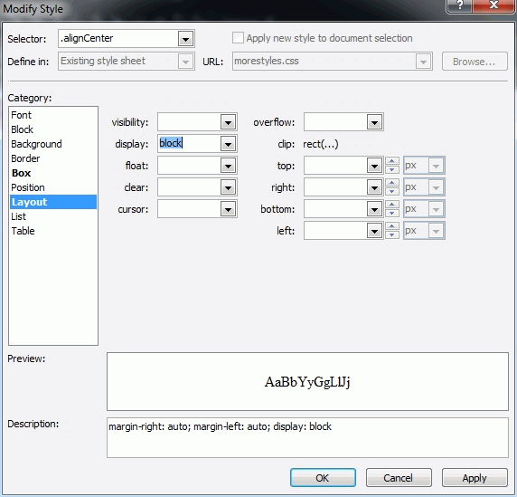
- lets create a class to center the image: Click on New style (right.bottom pane), name it .alignCenter, select Box: margin right and left to auto (others leave blank) as in this image.
- then select Layout and set display to block -- this will box the content we apply the class.
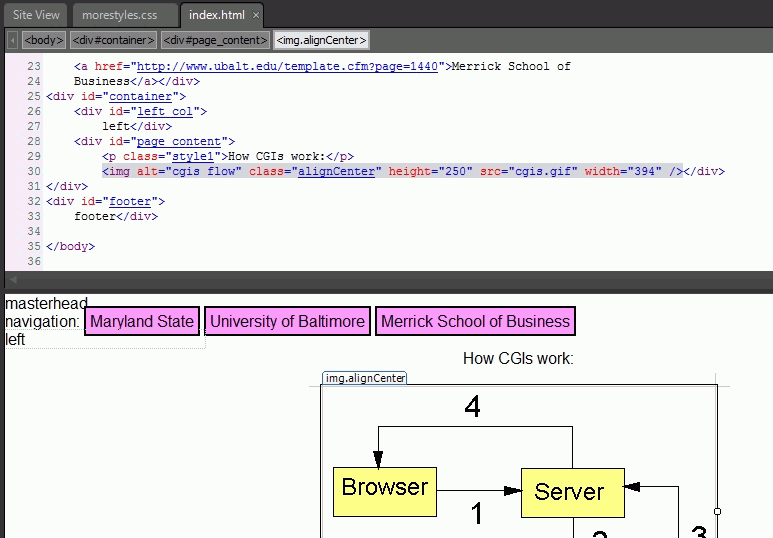
- to continue our example click on the image and click on the .alignCenter class (see here) to have the image centered in the right column. Of course to center the paragraph we could just use the center symbol in the toolbar, like we did as shown in this splitview.
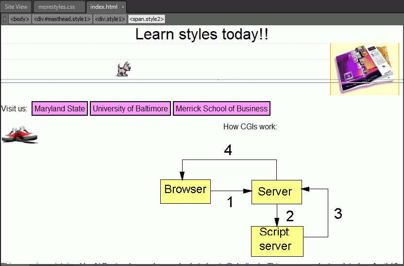
Of course we could have created other classes very similar as .alignRight and .alignLeft. The only difference would be that the Layout category would be inline and float to either left or right, respectively, as shown here for .alignLeft I added an image at left and used the .alignLeft class. In addition I also added another image at the top and used .alignRight class. The dog was just for fun ... Finally, a disclaimer was added as the footer, as shown in design view and in the browser.
Pseudo classes
There are elements, primarity links, that have additional class attributes:
- a:active => clicked, clicking link, default color red.
- a:focus => element can receive mouse or keybord input.
- a:hover => mouse over link or other element
- a:link => unvisited link, default color blue
- a:visited => clicked link, default color purple
You can Add New Styles for each one of them, and also modify later to fit your design. This is an example to changing the visited link a:visited to gray.
There are many additional topics on styles in expression web 3 that you may learn by yourself, but between last class materials in CSS layout and today's class we have seen its main features.
Images and imagemaps (hotspots)
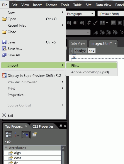
We have seen an introduction to images previously. Expression Web, although not a graphical editor, provides the ability of cropping, creating beveled borders, making transparent, rotating, flipping, creating thumbail images, and in addition allow to create graphical buttons. First lets select View,Toolbars, Pictures to add the pictures toolbar as shown here. Lets create a new html file and save it as images.html to see some examples of expression web image features.
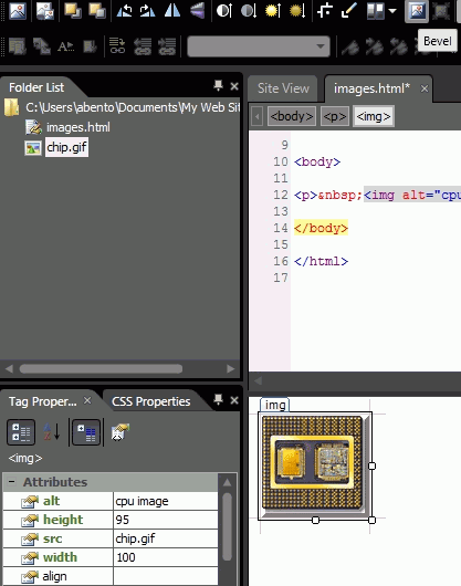
- use File Import, file, add file, then browse and select an image -- in our example chip.gif
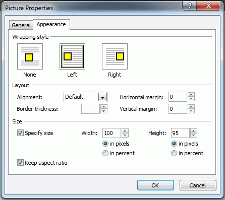
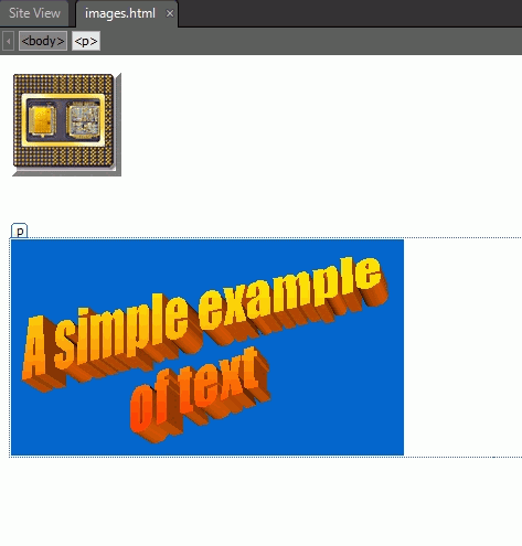
- lets start by selecting how the image and text should flow in a page: right-click and select picture properties, appearance, and position the image to the left allowing the text wrap around it, by clicking on the wrapping style left, as shown in this example.
- lets add beveled borders to to image: click on the image, then select the Bevel symbol as shown in this example.
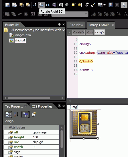
- for the sake of demonstration lets rotate the image 90 degrees right: click on the image, then select the Rotaste clockwise symbol as shown in this other example. Of course flipping is very similar.
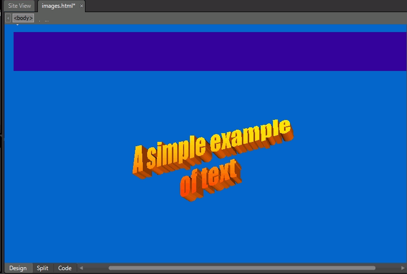
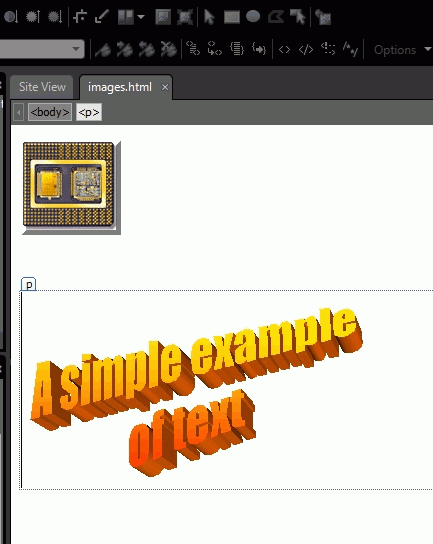
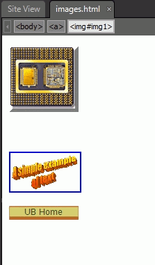
- lets now import an image saved in PowerPoint as a gif with a small area of text and lots of blue background, as shown in this image.
- The first thing we want to do is to crop the image to get rid of most of the blue: click on the image, then on the pictures toolbar, click Crop and drag the handles of the cropping box to resize and include the part of the picture that you want to keep, finally click on the crop symbol again, as shown here. We need to save the page to see the result.
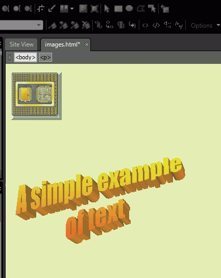
- lets now make the image transparent, hiding the blue background: click on the image, then select the transparent symbol on the picture toolbar and click on the color in the image you want to make transparent, in our case blue, and you can see the result. If we change the page background to ligh-yellow, as in this example the blue is still gone.
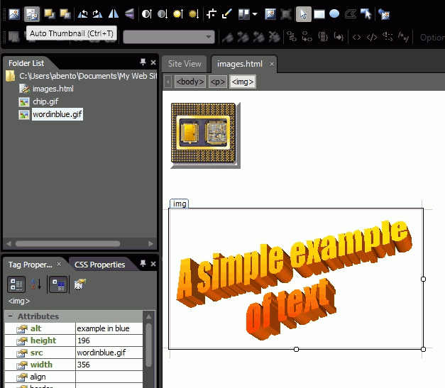
- we can also create thumbnails of images so that a page is not "heavy" to load: click on the image, then select the Auto Thumbnail from the picture toolbar, as shown here, and you can see the result.
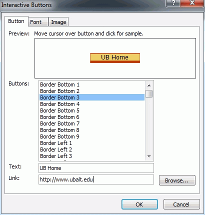
- finally, you can also create graphical buttons to link to other sites or pages: click on Insert, Interactive buttons, and choose a button, type a text to the button, and a enter the link to go when the button is pressed, as shown here, of course selecting image in the button dialog can change the size of the button, etc, the result of the example is here.
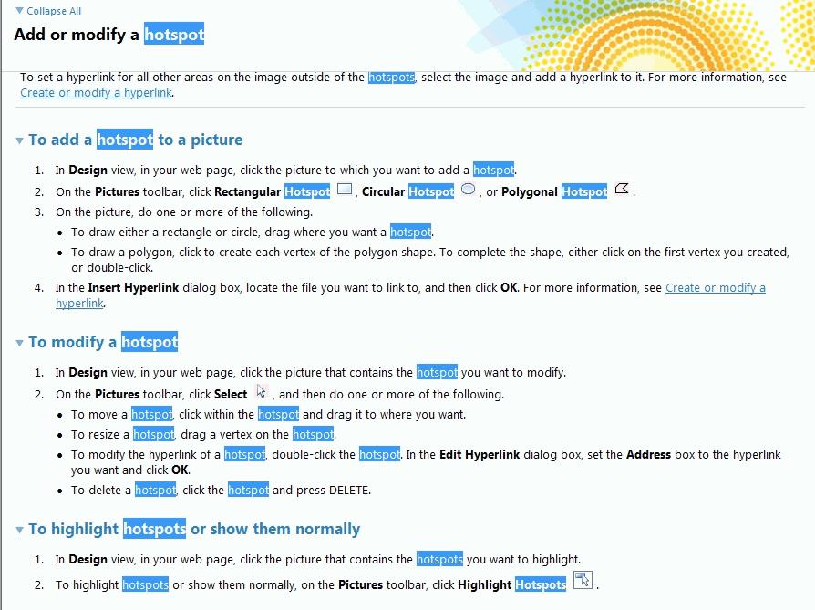
We also have seen imagemaps previously. Lets create an imagemap (hotspots) in expression web:
- As usual to create a new site, select Site, New site, General and Empty Site and we call it hotspots2.
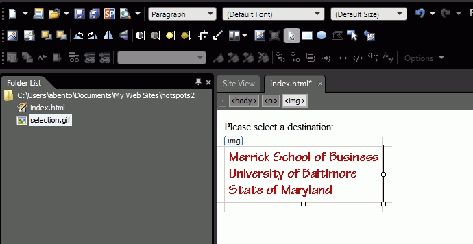
- next copy an image to the site (it is a good practice to create a folder with images for the site and place all the images in this folder), in our example we copied selection.gif.
- click on File, New, Html, save the file as index.html, and change the title to choices, as shown in this image.
- select View, Toolbars, Pictures to add the pictures toolbar, as shown here.
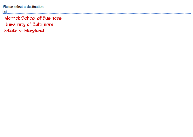
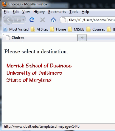
- type in the top of the page: Please select a destination:
- drag and drop the destination.gif in the page as shown in this image.
- using the picture toolbar, click on the select symbol and in the image, as shown in this example.
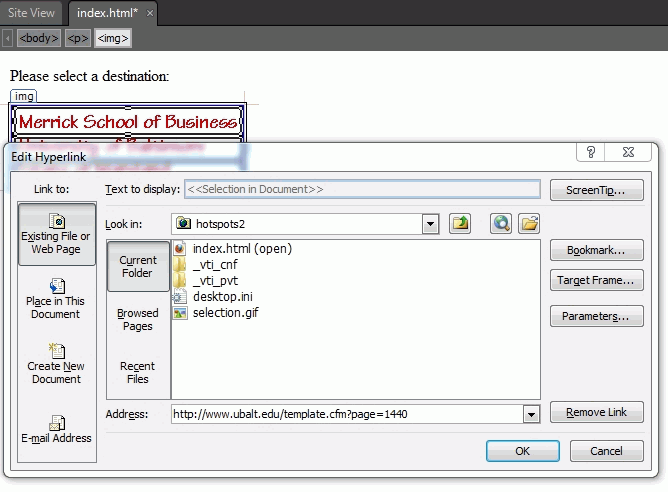
- again, using the picture toolbar, select the rectangle symbol and draw it around Merrick School of Business as shown here.
- when the rectangle is finsihed we are asked to enter an URL for the hotspot, as shown in this other image.
- we repeated the rectable drawing around University of Baltimore and State of Maryland, and added the urls for them, as shown in the image with split code and design.
- we are almost finished, but for the annoying blue border around the image.
- the expression web help for hotspots is also available.
Revisiting frames
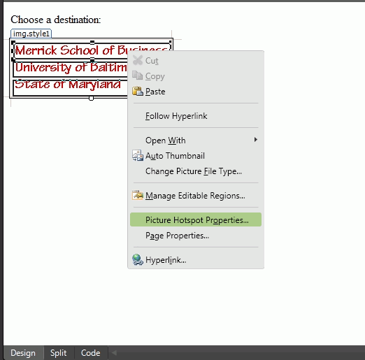
We also have seen frames previously, but it is time to revisite them in expression web and consider when we need to use them instead of styles. Once more lets use an example to see how you create frames in expression Web 3. We will start with what we learned in imagemaps and create a left frame (a regular page with target equal to righ, as we have seen in a previous class)using the index.html page we created in the imagemap part of this tutorial and save it as left.html.
- once we save index.html as left.html we are ready to edit each link in a frame context
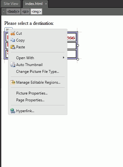
- right-click on the Merrick School area of the picture and select Picture Hotspot Properties.
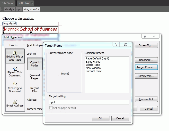
- in the Edit Hyperlynk dialog click on the target button and type right.
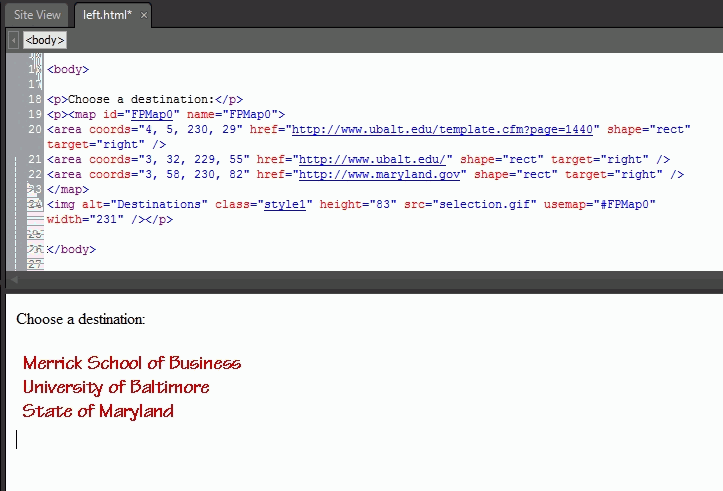
- repeat what was done to Merrick School for University of Baltimore and State of Maryland and all links will now target a right frame, as shown in this split view of the left.html
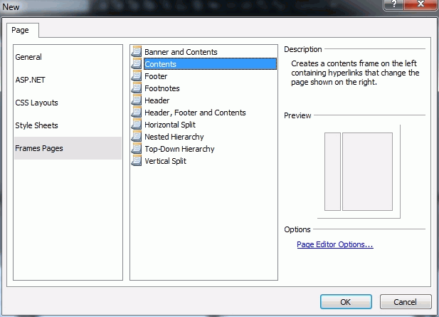
- we are ready to create the frame definition (the frameset) -- File, New, Frames Pages, Contents ,as shown here (of course we could have selected many other formats, but this is the simplest).
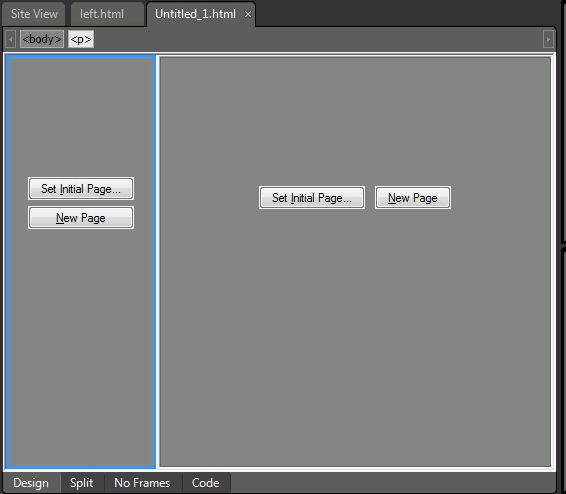
- when you click OK a new file will be open as untitled_1.html, with two pages to be defined, either by creating them new (new page), or inserting an existing page (set initial page).
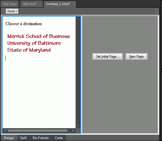
- we will use the left.html page in the left frame in our example, selecting set initial page, left.html, as shown here.
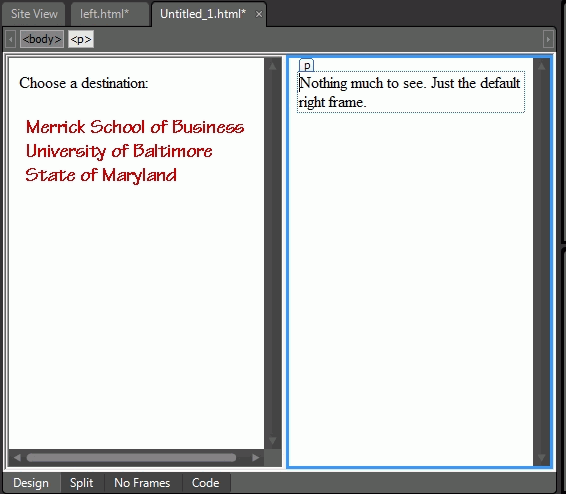
- in the right side we will choose New Page, and type a simple message, as shown in this image.
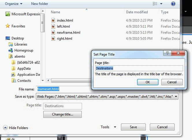
- then we save the file as frameset.html, and use destinations as its title.
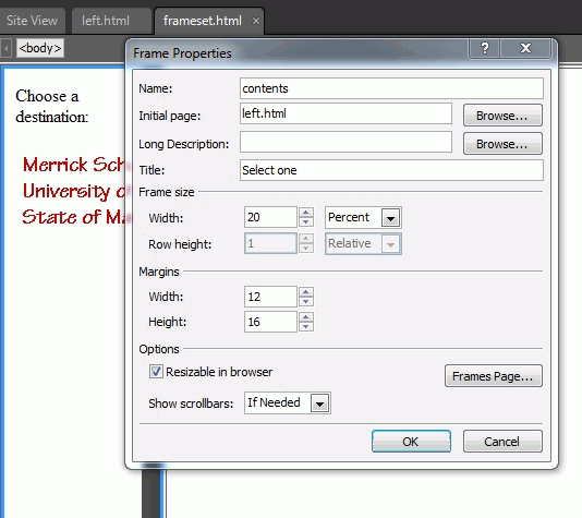
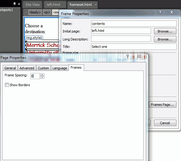
- the frameset and the frames pages are done, but we may need to set some properties:
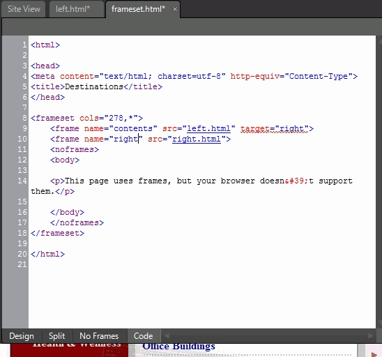
- finally, we need to be sure that the right frame id called right like we used in the left.html page, if not we can change directly in the code, like we did in the example.
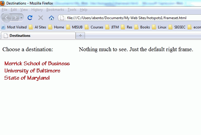
- here it is working on a browser,
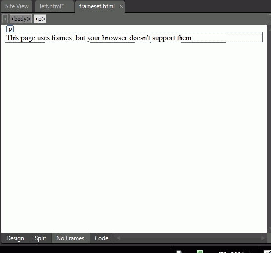
- please note that expression web also creates text for noframes browsers.
Frames are sometimes confusing to viewers when they create bookmarks of pages shown in the frames, when they may be in fact bookmarking the frameset page. The main reason to use frames is to separate navigation from content: one or more frames are used for navigation and the other pages just contain content, without navigation, as if the pages were developed individually. An example of this are the Microsoft MSDN pages.
This page is maintained by Al Bento who can be reached at abento@ubalt.edu. This page was last updated on April 12, 2010. Although we will attempt to keep this information accurate, we can not guarantee the accuracy of the information provided.